Conceptual Learning Outcomes
2. Use regression models to calculate estimates and predictions.
3. Interpret coefficient estimates in regression models in context.
4. Calculate and interpret regression sums of squares SSR, SSM, and SST, and coefficient of determination, \(R^2\), and F-statistics.
5. Draw conclusions about model estimates, \(R^2\), and F-statistics using graphical representations of data.
6. Explain the least squares estimation process.
Computational Learning Outcomes
E. Fit statistical models in R and interpret results.
2.1 Fitting Models to Data
2.1.1 King County, WA Houses
Research Question: How much does being on the waterfront add to the value of a house?
King County Washington, home of Seattle, contains scenic waterfront properties along Elliott Bay, Washington Lake, and Lake Sammamish. In this section, we’ll how being located on the waterfront affects the price of a house.
We work with a sample of 200 houses that sold between 2014 and 2015 in King County, WA. A total of 25 houses were located on the waterfront, while the other 175 houses were not on the waterfront.
The data used in this section are a subset of the data available in the [Kaggle “House Sales in King County, USA”] (https://www.kaggle.com/datasets/harlfoxem/housesalesprediction) dataset.
2.1.2 Terminology
In this section, we’ll use statistical models to predict the prices of houses in King County, WA, using information about whether or not they lie on the waterfront.
In a statistical model,
The variable we are trying to predict (price) is called the response variable (denoted \(Y\)).
Variable(s) we use to help us make the prediction is(are) called explanatory variables (denoted \(X\)). These are also referred to as predictor variables or covariates.
In this section, we’ll attempt to predict the price of a house, using information about its size (in square feet), and whether or not it is on the waterfront. The price is our response variable, while size and waterfront location are explanatory variables.
Categorical variables are variables that take on groups or categories, rather than numeric values, for example, whether or not the house is on the waterfront.
Quantitative variables take on meaningful numeric values, for example the number of square feet in the house.
2.1.3 Categorical Explanatory Variable
We’ll predict the price of a house based on whether or not it is on the waterfront.
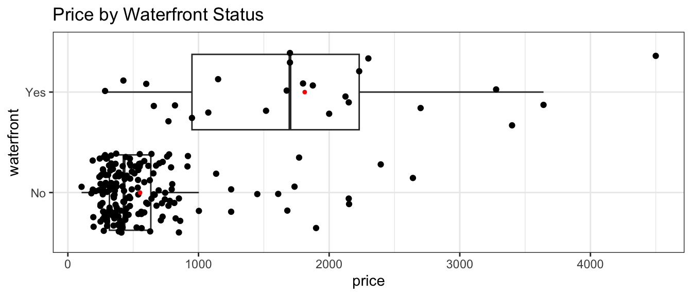
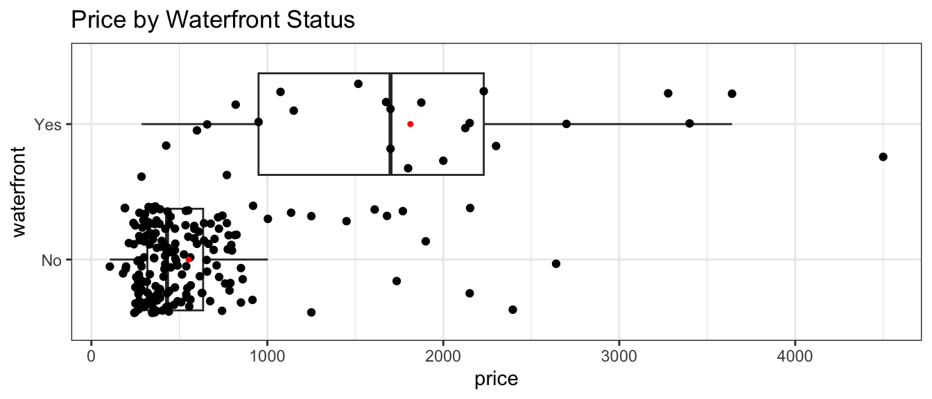
The boxplot shows the distribution of prices for waterfront and non-waterfront houses. The red dots indicate the mean.
The intercept \(b_0\) represents the expected (or average) value of the response variable in the “baseline” category (in this case non-waterfront).
The coefficient \(b_1\) represents the expected (or average) difference in response between a category and the “baseline” category.
On average, a house that is not on the waterfront is expected to cost 552.66 thousand dollars.
On average a house that is on the waterfront is expected to cost 1260.29 thousand (or 1.26 million) dollars more than a house that is not on the waterfront.
Prediction
We can predict the price of a house with a given number of square feet by plugging in either 1 or 0 for the waterfront variable.
The predicted price of a house on the waterfront is:
Notice that the predicted prices for each category correspond to the average price for that category.
2.1.4 Multiple Explanatory Variables
It’s possible that houses might be different from houses not on the waterfront in other ways as well. For example, waterfront houses might be bigger than non-waterfront houses. To account for this, we can add the number of square feet in the house to our model. This ensures we are comparing houses of the same size.
A model with two or more explanatory variables is called a multiple regression model.
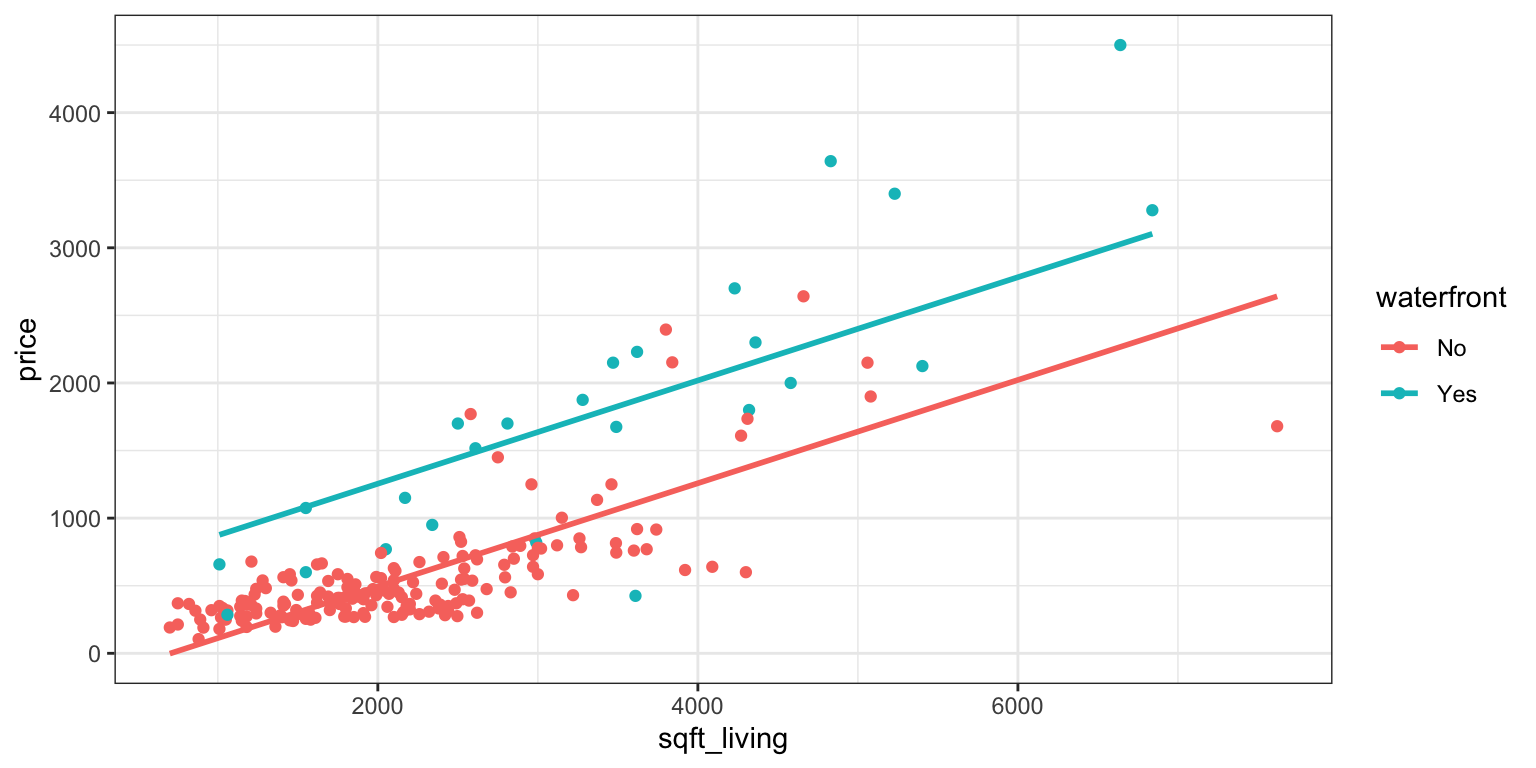
These are both linear equations with slope \(b_2\). The y-intercept, however, is different (\(b_0\) for houses not on the waterfront, and \(b_0 + b_1\) for houses on the waterfront). Thus, the model assumes that price increases at the same rate, with respect to square feet, regardless of whether or not it is on the waterfront, but allows the predicted price for a waterfront house to differ from a non-waterfront house of the same size.
The geom_parallel_slopes(se=FALSE) command adds regression lines with a common slope. This function is part of the moderndive R package.
The intercept \(b_0\) represents the expected (or average) value of the response variable, when all quantitative explanatory variables are equal to 0, and all categorical variables are in the “baseline” category. This interpretation is not always sensible.
For a categorical variable, we interpret the coefficient \(b_j\) as the expected difference in the response variable between that category and the “baseline” category, assuming all other explanatory variables are the same.
For a quantitative variable, we interpret the coefficient \(b_j\) as the expected change in the response variable for each one-unit increase of the explanatory variable, assuming all other explanatory variables are the same.
On average, a house that is not on the waterfront with 0 square feet is expected to cost -269.51 thousand dollars. This is not a sensible interpretation, since there are no houses with 0 square feet.
On average, a house on the waterfront is expected to cost 760.3 thousand dollars more than a house that is not on the waterfront, assuming square footage is the same.
For each 1-square foot increase in size, the price of a house is expected to increase by 0.38 thousand (or 380) dollars, assuming waterfront status is the same. Equivalently, for each 100-square foot increase in size, the price of a house is expected to increase by 38 thousand dollars, assuming waterfront status is the same.
Question for thought: Notice that the estimated difference in price between waterfront and non-waterfront houses, after accounting for size, is 760.3, which is less than the estimated difference when we did not account for size, which was 1260.29. Why is this? Hint: look at the scatterplot displaying house price, size, and waterfront status.
Prediction
The predicted price of a 2,000 square foot house on the waterfront is:
We should only try to make predictions on houses within the range of the observed data. Since the largest house in the dataset is 8,000 square feet we should not try to predict the price of house with 10,000 square feet. Making predictions outside the range of the data is called extrapolating and is dangerous. Since trends we observe may not continue outside the range of the data we observe, it can lead to nonsensical results.
Conclusion: The data show that waterfront houses tend to be substantially more expensive than houses that are not on the waterfront. Based on the 200 houses in our sample, we estimated that waterfront houses cost 1260.29 thousand (i.e 1.26029) million dollars more than non-waterfront houses, on average. Comparing houses of the same size, the difference is smaller, but still substantial, as we estimated that a waterfront house is estimated to cost 760.3 thousand dollars more than a non-waterfront house with the same number of square feet.
2.2 Variability Explained by a Model
2.2.1 Measuring Variability Explained
Central Question: How do we compare models and measure how well they’re fitting the data?
We’ve seen a model for predicting house price based only on whether or not it is on the waterfront, and another that also considered the size of the house. We want to be able to measure how much information we gain when addition variable(s) are added to a model. To do that, we’ll compare each model to a model that contains no explanatory variables (i.e. no information about the houses other than price). This will tell us how much the information provided by waterfront status and square feet help us in predicting price.
2.2.2 Residuals
The difference between the actual and predicted values is called the residual. The residual for the \(ith\) case is
\[r_i = (y_i-\hat{y}_i)\]
We’ll calculate the residuals for three houses in the dataset, shown below.
Positive residuals indicate that the house sold for more than the model predicted, while negative residuals mean the house sold for less than the model predicted.
The predicted values and residuals from a model can be calculated automatically in R. The predicted values and residuals for the 3 houses are shown below.
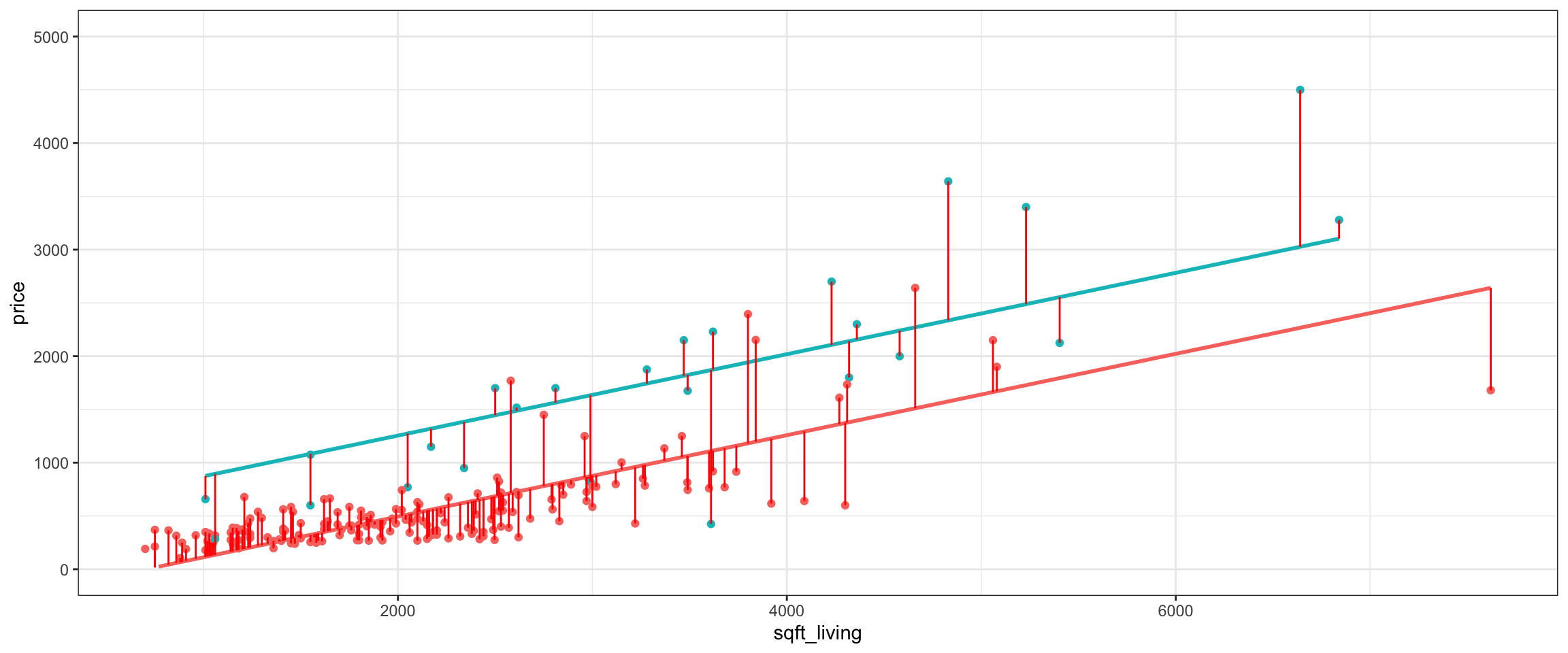
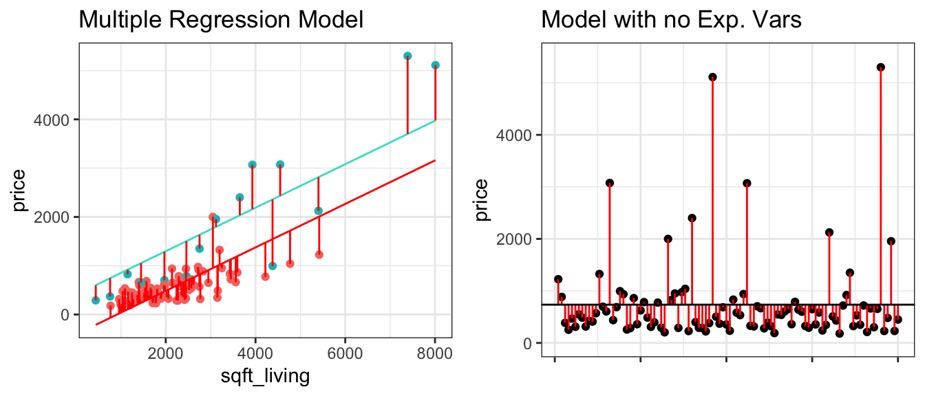
The actual and predicted values for all 200 houses in the dataset are shown below. Dots represent actual values, the regression lines represents the predicted values, and each vertical displays the residuals.
To measure the amount of variability in the response variable explained by a model, we calculate the sum of the squared residuals and compare it to the sum of squared residuals for a model with no explanatory variables (i.e. no information other than the response variable). In the house price dataset, this tells us how much better we do at explaining variability in price using information about waterfront status and size than we would have done if we didn’t have this information and knew only the prices of the houses.
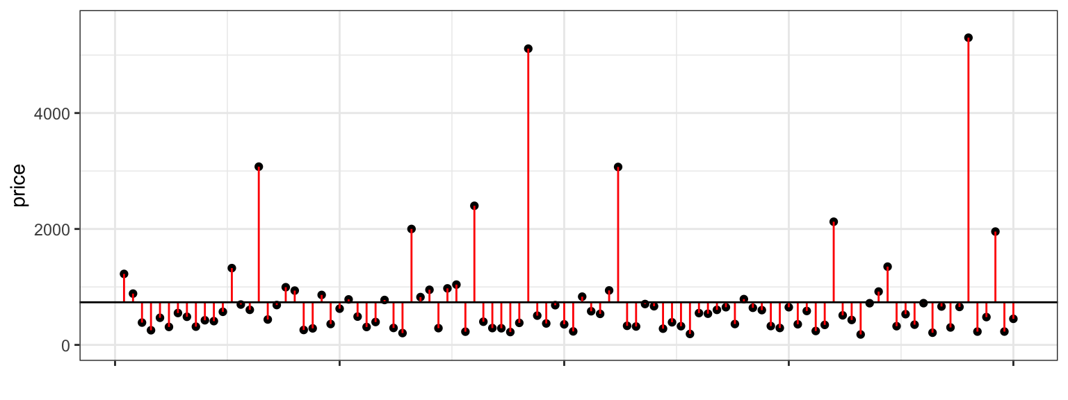
In a model with no explanatory variables, the best prediction we can make is to simply predict the price of every house to be equal to the mean price of the houses in the dataset, which is 710 thousand dollars.
The graph on the left shows residuals for the model using waterfront status and size, while the graph on the right shows residuals for the model using no explanatory variables and simply predicting every house to cost 710 thousand dollars.
Notice that the red lines are shorter in the figure on the left, indicating the predictions are closer to the actual values.
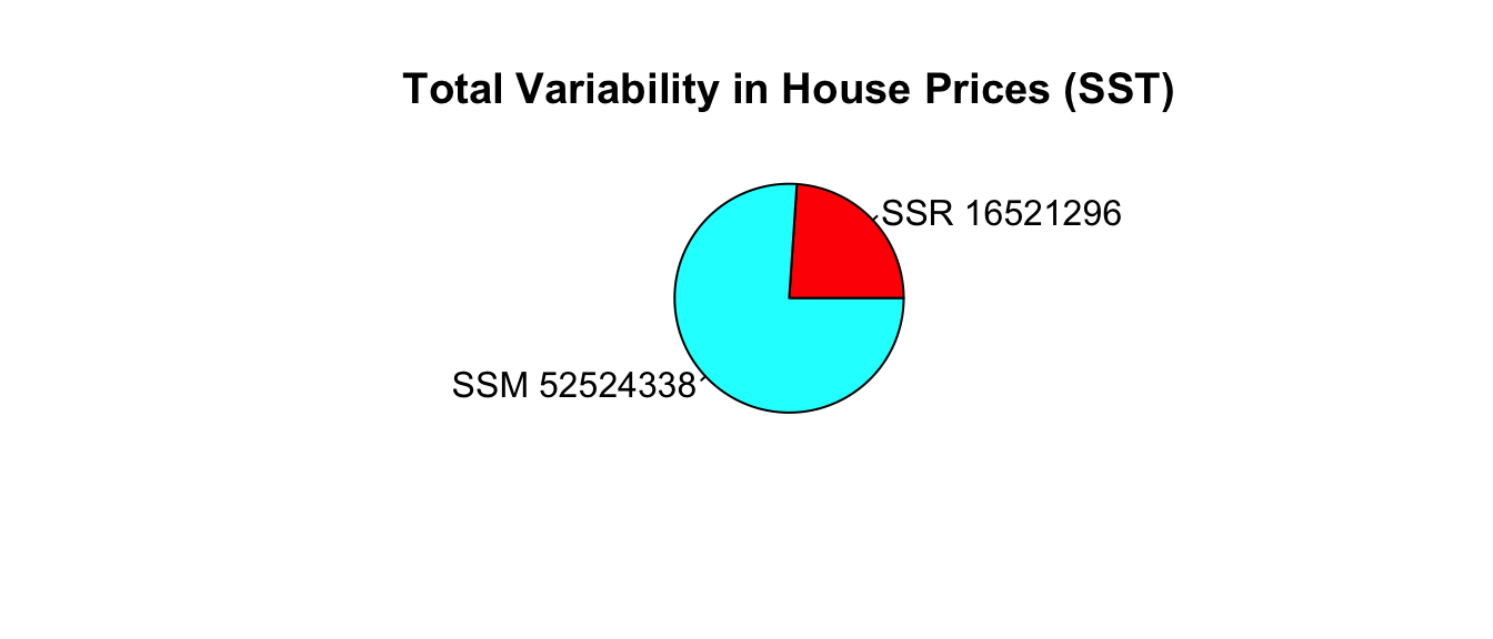
2.2.4 Variability Sums of Squares
We measure how well the model fits the observed data using the sum of the squared residuals. We have to square the residuals because if we just added up the residuals themselves, some would be positive and others negative and they would, in fact add to zero. By squaring, we ensure that each contribution is positive and larger square residuals represent bigger differences between observed and predicted values. This could also be achieved by taking the sum of the absolute values of the residuals, but there are certain advantages to using squared residuals and that is what is commonly done.
The sum of squared residuals (SSR) measures the amount of unexplained variability in the response variable after accounting for all explanatory variables in the model.
We compare SSR for our model to the sum of the squared differences we would get if we based our predictions on a model with no explanatory variables and used the overall mean of the response variable as the prediction for every case. This quantity is called the total sum of squares (SST).
By itself, the size of SST and SSR do not have much meaning, since they depend on the size and scale of the variable being measured. An SST value that is very large in one context might be very small in another. We can, however, compare SST and SSR to see how much information we gain by using the variables in the model. SST will always be larger than (or equal to) SSR. The smaller SSR is, compared to SST, the more the variables in the model have helped reduce the size of the residuals by explaining variability in the response variable.
We calculate the difference between SST and SSR and call this quantity the sum of squares model (SSM). This represents the amount of variability in the response variable that is explained by the model.
It can be shown that \(\text{SSM}=\displaystyle\sum_{i=1}^n(\hat{y}_i-\bar{y})^2\).
Since SSR, SST, and SSM depend on the units of the response variable, there is no universal way to determine what constitutes large or small values for these quantities. We can, however, develop a universal standard for comparison by dividing SSM by SST. This gives a ratio between zero and one, which represents the proportion of total variability in the response variable explained by the model. This quantity is called the coefficient of determination, denoted \(R^2\).
\[R^2=\frac{SSM}{SST}= \frac{SST-SSR}{SST}\]
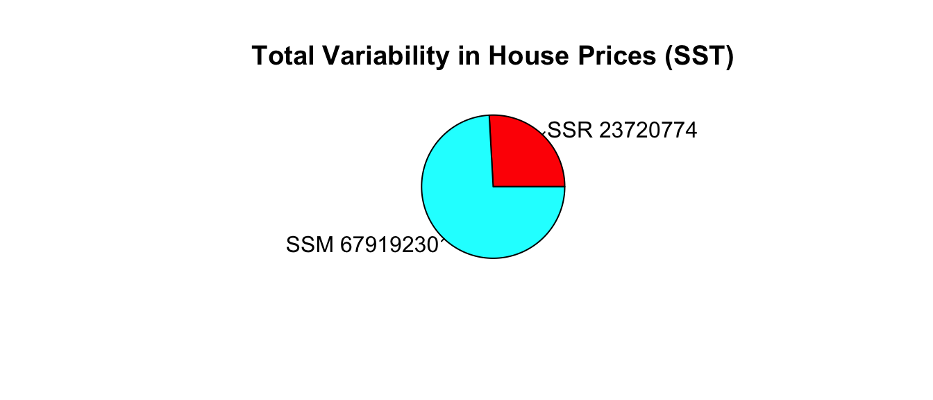
\[R^2 = \frac{67919230}{91640004}=0.74.\]
Approximately 74.1% of the total variability in sale price is explained by the model using square feet and waterfront status as explanatory variables.
We can similarly calculate the proportion of variability explained by the model using waterfront as an explanatory variable.
Recall that in this model, the predicted price of a house with a waterfront is given by the average price of all waterfront houses, and the predicted price of a non-waterfront house is given by the average price of all non-waterfront houses.
We can calculate residuals using these predicted values, and compare them to the residuals resulting from a model with no explanatory variables, which uses the overall average price for all predictions.
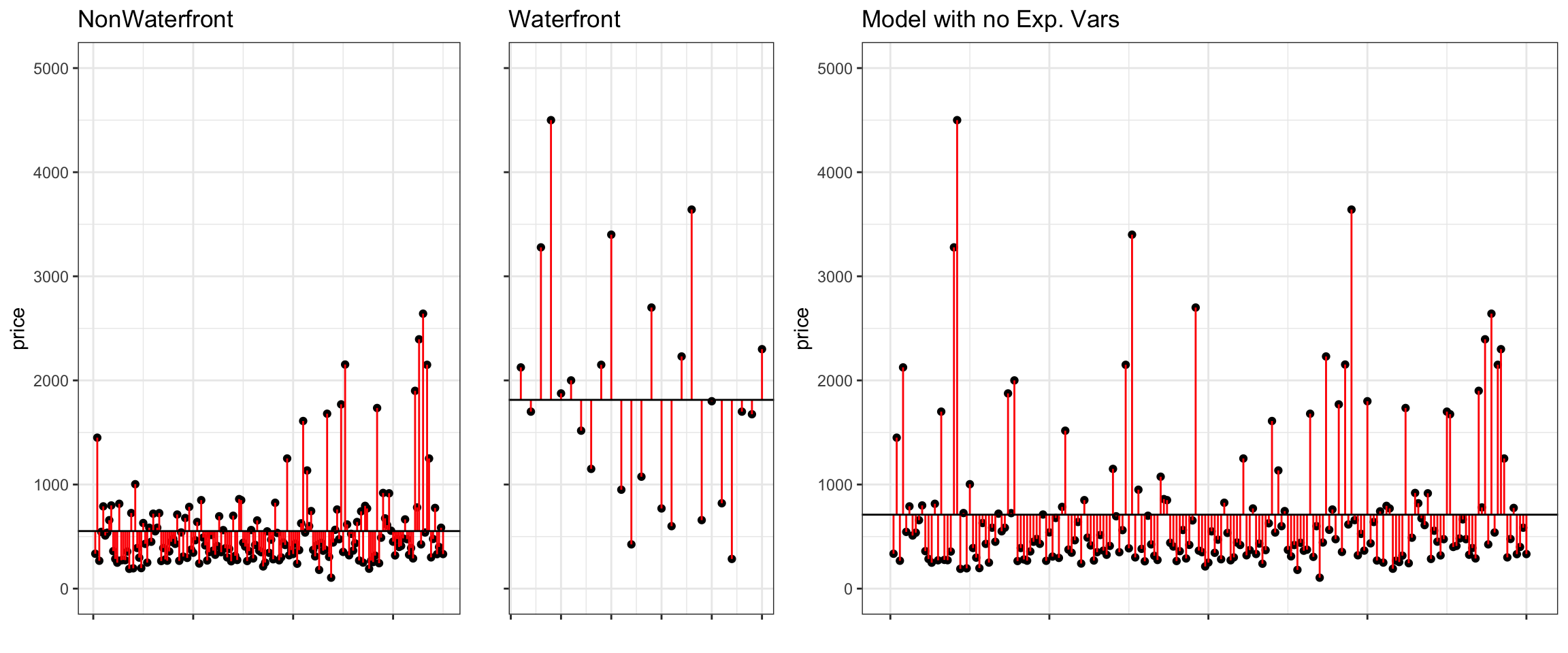
The left two figures show the residuals resulting from a model that accounts for waterfront status. The figure on the right shows the residuals resulting from the model with no explanatory variables.
Notice that after accounting for waterfront status, the differences between observed and predicted values are bigger than they were in the model that accounted for square feet, in addition to waterfront status.
The predicted prices for the three houses we’ve seen before are:
Three_Houses
# A tibble: 3 × 4
     ID price waterfront sqft_living
  <int> <dbl> <fct>            <dbl>
1     3  268. No                1590
2    37 1875  Yes               3280
3    50  540. No                2100
Approximately 38% of the total variability in sale price is explained by the model using waterfront status as the explanatory variable.
We calculate \(R^2\) directly in R.
summary(M_House_price_wf)$r.squared |>round(4)
[1] 0.3791
2.2.6 Variability Explained by Sq. Ft. Model
We’ve seen a model using both square feet and waterfront status, and also one using only waterfront status. Now, we’ll consider one using only square feet.
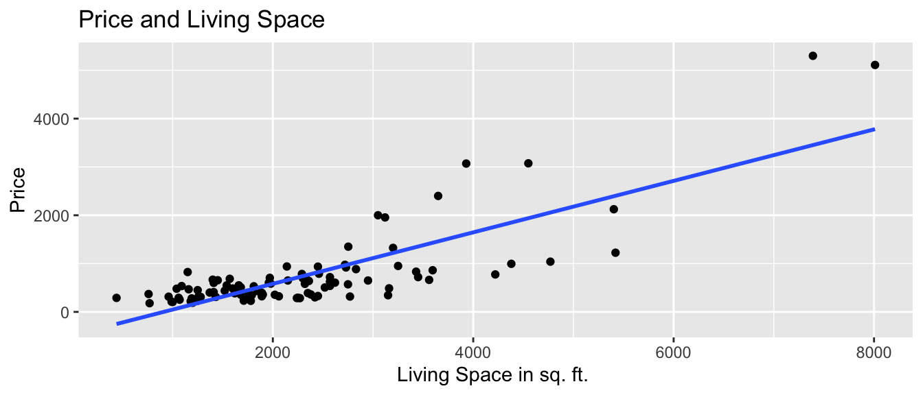
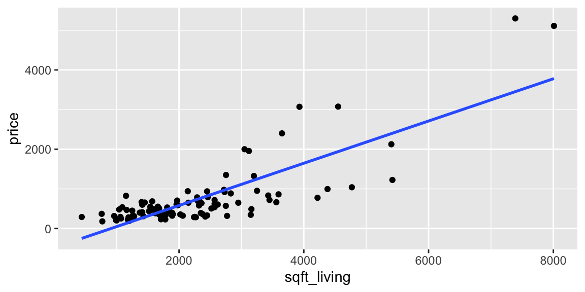
In this model, we only have a single regression line relating price to square feet, rather than two lines, as we saw when we accounted for waterfront status.
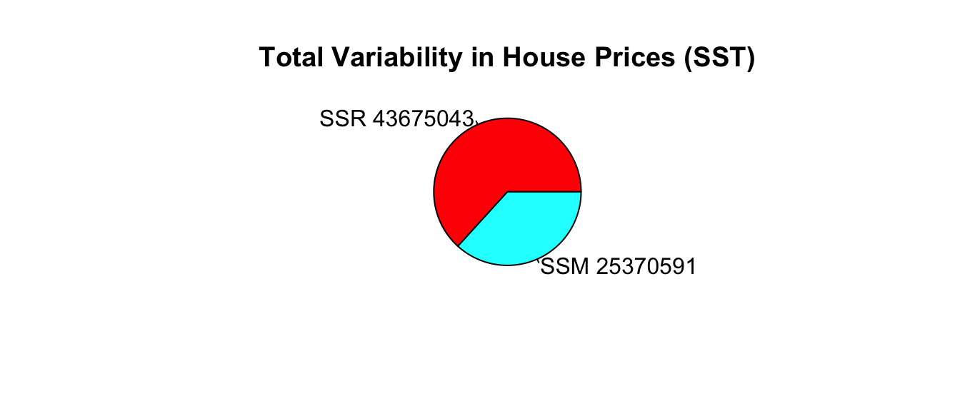
Approximately 62% of the total variability in sale price is explained by the model using square feet as the explanatory variable.
We calculate \(R^2\) directly in R.
summary(M_House_price_sqft)$r.squared |>round(4)
[1] 0.6227
2.2.7 Linear Correlation Coefficient
For models with a single quantitative explanatory variable, the coefficient of determination is equal to the square of the correlation coefficient \(r\), discussed in Chapter 1.
For linear models with a single quantitative variable, the linear correlation coefficient\(r=\sqrt{R^2}\), or \(r=-\sqrt{R^2}\) (with sign matching the sign on the slope of the line), provides information about the strength and direction of the linear relationship between the variables.
\(-1 \leq r \leq 1\), and \(r\) close to \(\pm1\) provides evidence of strong linear relationship, while \(r\) close to 0 suggests linear relationship is weak.
cor(Houses$price, Houses$sqft_living)
[1] 0.7891107
There is a positive and fairly strong relationship between price and square feet of a house.
While the correlation coefficient, \(r\) is equal to the square root of \(R^2\) in the simple case of a model with one quantitative explanatory variable and a quantitative response variable, \(R^2\) has much broader application, as \(r\) is defined only for models with one quantitative explanatory variable and a quantitative response, while \(R^2\) is relevant for any linear model with a quantitative response variable.
2.2.8 Adding Age
We’ve seen that a multiple regression model that accounts for both square feet and whether or not the house is on the waterfront explains more variability in price than a model with only one of those variables. We can consider adding additional variables to the model to try to even better explain variability with price.
Let’s consider adding the age of the house to the model.
Since we now have two quantitative and one categorical explanatory variable, in addition to our response variable, it is difficult to produce a graph that would visualize this model. We can, however, fit the model in R and calculate predicted values as well as model sums of squares, just as we’ve done before.
The age coefficient estimate \(b_3\) tells us that for each additional year in age, the expected price is expected to increase by 1.4 thousand dollars, assuming square feet and waterfront status are held constant. This is not a very large change.
We can calculate predicted prices, residuals, SSR, SSM, and \(R^2\) the same way we did for the previous models, but let’s rely on R for these calculations.
Recall that the model with square feet and waterfront, but not age, as explanatory variables had an \(R^2\) value of 0.7412. Adding age to the model only resulted in a tiny increase in \(R^2\), meaning that age only explains a very small percentage of the variability in price that was not explained by size and waterfront status. Thus, it may not be beneficial to add age to the model.
When a new variable is added SSR will never increase and \(R^2\) will never decrease. Thus, adding even unimportant variables typically lead to small increases in \(R^2\). This does not necessarily mean we should add these variables. Doing so can make the model harder to interpret. It’s also true that making a model more complex by adding additional variables makes it more prone to a phenomenon called “overfitting.” This means that the model starts modeling random noise, rather than true relationships in the data it was built on (in this case, the 200 houses), causing it to perform worse when predicting new houses than a simpler model with fewer variables would. We’ll look more at overfitting later in the course.
Sometimes, it can be good to include a variable in a model even if it only leads to a small increase in \(R^2\). If we were interested in drawing and reporting conclusions on the relationship between the age and expected price of a house, it would be worth including age in the model, so we can report that it does not appear to make much difference. This result might be surprising and interesting in and of itself. There is no single correct model for a given set of data. We should choose models based on relationships we see in the data, as well as the research question(s) we are interested in answering.
2.2.9 Summary: SST, SSR, SSM, \(R^2\)
the total variability in the response variable is the sum of the squared differences between the observed values and the overall average.
\[\text{Total Variability in Response Var.}= \text{SST} =\displaystyle\sum_{i=1}^n(y_i-\bar{y})^2\]
the variability remaining unexplained even after accounting for explanatory variable(s) in a model is given by the sum of squared residuals. We abbreviate this SSR, for sum of squared residuals.
the variability explained by the model, abbreviated SSM, is given by
\[ \text{SSM} = \text{SST} - \text{SSR} \]
The coefficient of determination (abbreviated \(R^2\)) is defined as
\[R^2=\frac{\text{Variability Explained by Model}}{\text{Total Variability}}=\frac{\text{SSM}}{\text{SST}} =\frac{\displaystyle\sum_{i=1}^n(\hat{y}_i-\bar{y})^2}{\displaystyle\sum_{i=1}^n(y_i-\bar{y})^2}\]
Note that some texts use different abbreviations than the ones used here. When working with resources outside this class, be sure to carefully check the notation being used.
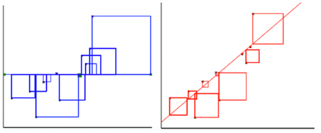
For the model with a single quantitative explanatory variable.
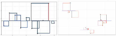
Model with a single categorical explanatory variable with 3 categories:
Blue Area = Total Variability (SST)
Red Area = Variability Remaining Unexplained by Model (SSR)
Blue Area - Red Area = Variability Explained by Model (SSM)
\(R^2 = \frac{\text{Area of Blue Squares} - \text{Area of Red Squares}}{\text{Area of Blue Squares}} = \frac{\text{SST}-\text{SSR}}{\text{SST}}= \frac{\text{SSM}}{\text{SST}}\)
2.2.10 Model Comparison Summary
Model
Variables
Unexplained Variability
Variability Explained
\(R^2\)
0
None
91640004
0
0
1
Sq. Ft.
34576162
57063842
0.623
2
Waterfront
56895095
34744909
0.379
3
Sq. Ft. and Waterfront
23720774
67919230
0.741
4
Sq. Ft., Waterfront, and Age
23436092
68203912
0.744
Comments on\(R^2\):
\(R^2\) will never decrease when a new variable is added to a model.
This does not mean that adding more variables to a model always improves its ability to make predictions on new data.
\(R^2\) measures how well a model fits the data on which it was built.
It is possible for a model with high \(R^2\) to “overfit” the data it was built from, and thus perform poorly on new data. We will discuss this idea extensively later in the course.
On some datasets, there is a lot of “natural” variability in the response variable, and no model will achieve a high \(R^2\). That’s okay. Even a model with \(R^2 = 0.10\) or less can provide useful information.
The goal is not to achieve a model that makes perfect predictions, but rather to be able to quantify the amount of uncertainty associated with the predictions we make.
Conclusion: We saw that accounting for the size of the house helps explain variability in price, as \(R^2\) improves from 0.379 to round((SST_M_House_price-SSR_M_House_price_wf_sqft)/SST_M_House_price,3) when square feet is added to a model that already includes waterfront status. Accounting for age does not appear very important, as \(R^2\) only increases a very small amount to 0.744 when age is added to the model.
2.3 ANalysis Of VAriance
Central Question: Does adding variable(s) to a model help us explain variability in the response variable?
2.3.1 Sub-Models
In the preceding sections, we’ve seen 5 different models for predicting house price using some combination of square feet and waterfront status.
A model is defined to be a submodel of a larger model, if the larger model contains all of the model’s variables plus more.
Model
Variables
Unexplained Variability
Variability Explained
\(R^2\)
0
None
91640004
0
0
1
Sq. Ft.
34576162
57063842
0.623
2
Waterfront
56895095
34744909
0.379
3
Sq. Ft. and Waterfront
23720774
67919230
0.741
4
Sq. Ft., Waterfront, and Age
23436092
68203912
0.744
Model 1 is a submodel of Model 3, since all variables used in Model 1 are also used in Model 3.
Model 2 is also a submodel of Model 3.
Models 1, 2, and 3 are all submodels of Model 4.
Model 0 is a submodel of Models 1, 2, 3, and 4.
Models 1 and 2 are not submodels of each other, since Model 1 contains a variable used in Model 2 and Model 2 contains a variable not used in Model 1.
2.3.2 F-Statistics
When one model is a submodel of another, we can compare the amount of variability explained by the models, using a technique known as ANalysis Of VAriance (ANOVA).
p = # terms in Full Model, not including the intercept
q = # terms in Reduced Model, not including the intercept
n = number of observations
We calculate a statistic called F that measures the amount of variability explained by adding additional variable(s) to the model, relative to the total amount of unexplained variability.
\[\begin{aligned}
F
&= \frac{\frac{\text{SSR}_{\text{Reduced}}-\text{SSR}_{\text{Full}}}{p-q}}{\frac{\text{SSR}_{\text{Full}}}{n-(p+1)}}
\end{aligned}\]
Large values of F indicate that adding the additional explanatory variables is helpful in explaining variability in the response variable
Small values of F indicate that adding new explanatory variables does not make much of a difference in explaining variability in the response variable
What counts as “large” depends on \(n, p,\) and \(q\). We will revisit this later in the course.
Example 1
Let’s Calculate an ANOVA F-Statistic to compare Models 2 and 3. This will tell us whether adding information about square feet helps explain variability in price, compared to a model using only waterfront status.
Conclusion An F-statistic of 275.51 is quite large and provides strong evidence that adding waterfront status to a model already including square feet helps better explain variability in sale price.
We previously saw that the model including both square feet and waterfront status had a \(R^2\) value considerably higher than the one including only square feet. This large F-statistic is further evidence of the benefit of using both variables in our model.
Example 2
We’ll calculate an F-statistic to compare Models 3 and 4. This can help us determine whether it is worthwhile to include age in a model that already includes square feet and waterfront status.
Conclusion: Now, the F-statistic is much smaller than we’ve seen before, indicating that adding age to the model does not help very much in explaining variability in price.
You might be wondering how large an F-statistic needs to be in order to merit using the larger model. This is a complicated question, which we’ll explore more in future chapters, but as a general rule, F-statistics larger than 4 typically provide evidence in favor of choosing the larger (full) model over the reduced one.
2.3.3 F-Statistic for Comparing Groups
While F-statistics can be used for models with quantitative or categorical variables, they are often used to compare groups for a categorical explanatory variable.
An F-statistic compares the amount of variability between groups to the amount of variability within groups. Larger F-statistics indicate more variability between groups, rather than within groups, indicating stronger evidence of differences between groups.
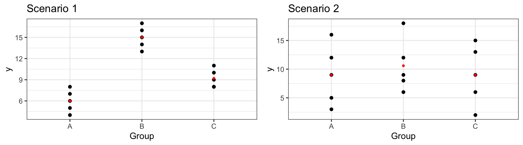
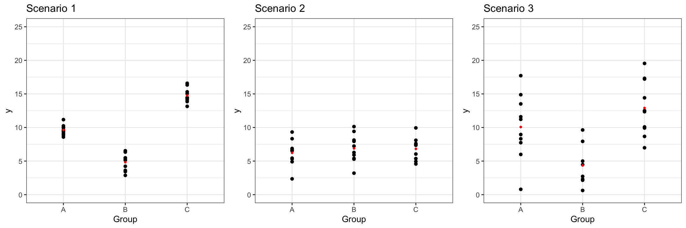
In scenario 1, we notice considerable differences between the groups, relative to the amount of variability within groups. In this scenario, knowing the group an observation is in will help us predict the response for that group, so we should account for the groups in our model. We would obtain a large F-statistic when comparing a model that includes group to one that contains only an intercept term.
In scenario 2, there is little difference between the overall averages in each group, and more variability between individual observations within each group. In a scenario like this, knowing the group an observation lies in does little to help us predict the response. In this scenario, predictions from a model that includes group as an explanatory variable would not be much better than those from a model that does not. Hence, we would obtain a small F-statistic.
We’ll use F-statistics to compare the prices of waterfront houses to non-waterfront houses, and also to compare the three different conditions of houses.
Example 1: Price by Waterfront Status
The boxplot shows the distribution of houses in each category, and the table below it provides a numerical summary.
When measuring differences between groups for a categorical variable, we compare a model with the categorical variable to one with only an intercept term. In this case, the models are:
Reduced Model: \[\widehat{\text{Price}}= b_0\]
Full Model: \[\widehat{\text{Price}}= b_0+ b_1 \times\text{waterfront}\]
We’ll fit the model in R. The coefficient estimates for \(b_0\), and \(b_1\) are shown below.
We previously calculated \(SSR_{full}\) to be
SSR_M_House_price_wf |>round(1)
[1] 56895095
For a model containing only an intercept term, like the reduced model, SSR is equal to SST.
Conclusion: The F-statistic is very large, indicating strong evidence that waterfront status is associated with the price of a house, which is consistent with what we’ve observed in our plots as well as \(R^2\) calculation.
Example 2: Price by Condition
One variable in the houses dataset, which we haven’t looked at yet, is the condition of the house at the time of sale. The table shows the number of houses in either 1) very good, 2) good, or 3) average or below condition.
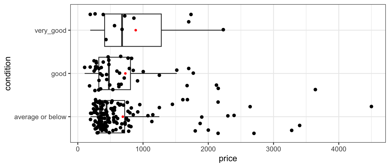
The boxplot shows the distribution of houses in each category, and the table below it provides a numerical summary.
Notice that while houses in very good condition are the most expensive, differences between the three conditions are not that large and there is a lot of variability within each condition group.
We’ll calculate an F-statistic for a model that includes condition, compared to a model with only an intercept term.
Reduced Model: \[\widehat{\text{Price}}= b_0\]
Full Model: \[\widehat{\text{Price}}= b_0+ b_1 \times\text{good condition}+ b_2\times\text{very good condition}\]
Notice that the equation includes separate variables for the “good” and “very” good conditions. These variables take on value 0 if the house is not in that condition, and 1 if the house is in that condition. Here, the “average or below” condition is considered the “baseline” category.
We’ll fit the model in R. The coefficient estimates for \(b_0\), \(b_1\) and \(b_2\) are shown below.
Note that in this case, \(p=2\), since the full model includes terms for both good and very good conditions, in addition to the “baseline” category of “average or below”. For a categorical variable with \(g\) groups, there will always be \(g-1\) terms in the model equation, one for each category other than the baseline.
Notice that the F-statistic of 0.45 is considerably smaller than the F-statistics we’ve seen previously.
Conclusion: Our analysis indicates that adding condition to a model with no other explanatory variables doesn’t seem to help improve the model’s ability to account for variation in price. Put another way, there doesn’t appear to be much evidence of difference in price between houses in the different conditions. This is again consistent with our conclusion based on the very small change in \(R^2\) that we saw when adding condition to the model in the previous section.
2.3.4 Relationship Between F-statistic and \(R^2\)
We’ve seen that both \(R^2\) and the F-statistic give us ways of comparing models and determining whether explanatory variables help explain variability in the response.
You may be wondering why we need to calculate F-statistics when we already have \(R^2\) to answer these questions. Here we’ll look at an example to illustrate the relationship between the two, showing how they’re alike, as well as how they differ.
Shown below are are two different scatterplots displaying relationships between variables \(x\) and \(y\).
Which plot do you think displays a stronger relationship between \(x\) and \(y\)?
We calculate \(R^2\) values for linear models fit to both sets of data.
We see that the \(R^2\) values are approximately the same.
You might have thought, however, that Scenario B shows a stronger relationship, and this would seem reasonable. Scenario B has 91 observations, while Scenario A only has 4, hence Scenario B has more information justifying a relationship between the variables.
The \(R^2\) value captures only the strength of the relationship in the observed data, without accounting for the number of observations. In this section, we’ll look at a different statistic that can be used to assess the strength of relationships between variables in a model that, unlike \(R^2\), accounts for the sample size.
For comparing a model with explanatory variable \(x\) to one with only an intercept term, we use the models:
Reduced Model: \[\widehat{y}= b_0\]
Full Model: \[\widehat{y}= b_0+ b_1 x\]
Since, \(p=1\) and \(\text{SSR}_{\text{Reduced}}=\text{SST}\), the F-statistic becomes:
Thus, we see that the F-statistic is closely related to \(R^2\), but it’s calculation involves one thing that the \(R^2\) calculation does not - the sample size!
While the scenarios had similar \(R^2\) values, Scenario B had a much greater F-statistic, due to the larger sample, size which provides more evidence of a relationship.
Both the F-statistic and \(R^2\) are useful measures of a model fit. Neither is necessarily better than the other. The F-statistic accounts for sample size, while \(R^2\) simply tells us how strongly related the variables are in the data we have. It is good to consider both when building and assessing models.
2.3.5 Alternate F-Stat Formula
We saw that F-statistics are useful for comparing categorical variables with multiple groups. The “variation between” over “variation within” interpretation of an F-statistic lends itself to another (mathematically equivalent) formula for the F-statistic. We calculate the ratio of variability between different groups, relative to the amount of variability within each group
For a categorical variable with \(g\) groups,
let \(\bar{y}_{1\cdot}, \ldots, \bar{y}_{g\cdot}\) represent the mean response for each group.
let \(n_1, \ldots, n_g\) represent the sample size for each group
Then \(\frac{\displaystyle\sum_{i=1}^g\sum_{j=1}^{n_i}n_i(y_{i\cdot}-\bar{y}_{\cdot\cdot})^2}{g-1}\) gives a measure of how much the group means differ, and
\(\frac{\displaystyle\sum_{i=1}^g\sum_{j=1}^{n_i}(y_{ij}-\bar{y}_{i\cdot})^2}{n-g}\) gives a measure of how much individual observations differ within groups
An alternative formula for this F-statistic is:
\[F= \frac{\text{Variability between groups}}{\text{Variability within groups}}= \frac{\frac{\displaystyle\sum_{i=1}^g\sum_{j=1}^{n_i}n_i(y_{i\cdot}-\bar{y}_{\cdot\cdot})^2}{g-1}}{\frac{\displaystyle\sum_{i=1}^g\sum_{j=1}^{n_i}(y_{ij}-\bar{y}_{i\cdot})^2}{n-g}}\]
It can be shown that this statistic is equivalent to the one we saw previously.
For models with only one categorical explanatory variable, “variability within vs variability between” interpretation of an F-statistic is frequently in the natural and social sciences. Such studies are often referred to as One-Way ANOVA’s. In fact, these are just a special case of the “full vs reduced” model interpretation of the F-statistic, which can be applied to any two models, as long as one is a submodel of the other. In this class, we’ll use the more general “full vs reduced” model formula, but you should be aware that this other formula is just a special case of the one we’ll use in this class.
2.4 Least Squares Estimation (LSE)
Central Question: How do we determine the line of best fit? That is, how do we determine the values of estimates\(b_0\), \(b_1\), \(b_2\), ?
2.4.1 Estimating Regression Coefficients
We’ve already used R to determine the estimates of \(b_0\), \(b_1\), \(b_2\), and \(b_3\) in various kinds of linear models. At this point, it is natural to wonder where these estimates are come from.
Regression coefficients \(b_0, b_1, \ldots, b_p\) are chosen in a way that minimizes the sum of the squared differences between the observed and predicted values. That is, we minimize
The process of estimating regression coefficients \(b_0, b_1, \ldots, b_p\) in a way that minimizes SSR is called least-squares estimation.
Example: Model with one quantitative variable
We start with an example of estimating the regression coefficients for a model with a single explanatory variable. This is easy to illustrate, since we can draw a scatter plot displaying our explanatory and response variable.
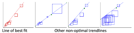
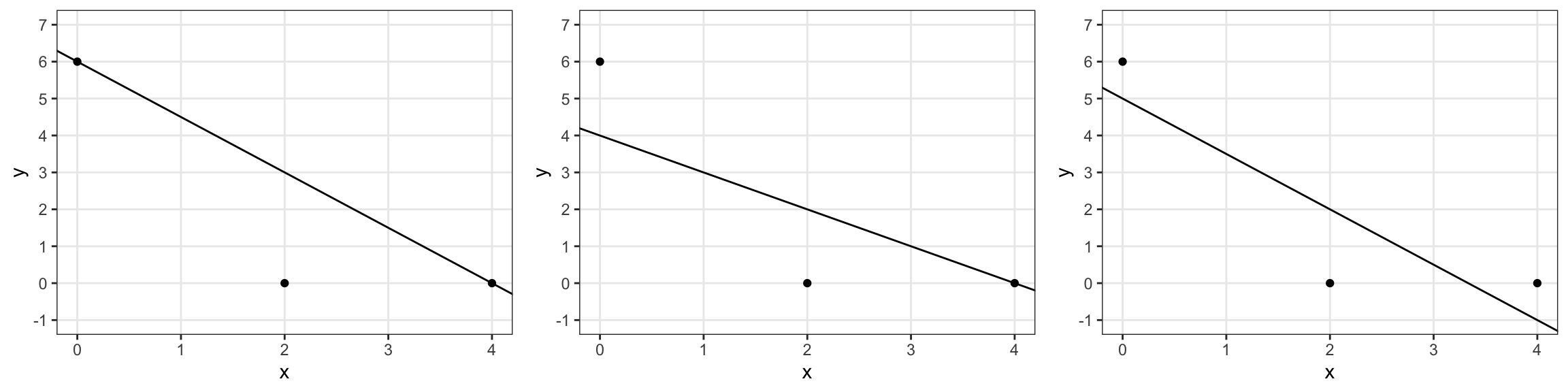
The figure below illustrates four possible trend lines that could be fit to a set of 10 points in a scatter plot. The first line is the line of best fit, in that it makes the sum of the squared residuals the smallest of all possible lines that could be drawn. The second through fourth plots all show examples of other trend lines that are not the line of best fit. The sum of squared residuals for each of these models is bigger than for the first one.
In the illustration, SSR is represented by the total area of the squares. The line of best fit is the one that make the area the smallest.
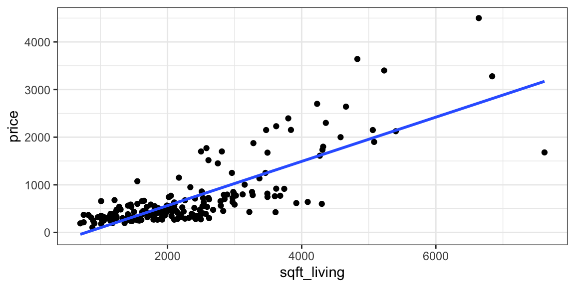
Returning to the model for predicting price of a house, using only size in square feet as an explanatory variable, the scatter plot, along with the slope and intercept of the regression line are shown below.
The line \(\text{Price} = -364.85 + 0.46\times \text{Square Feet}\) is the “line of best fit” in the sense that it minimizes the sum of the squared residuals (SSR). Any other choices for the slope or intercept of the regression line would result in larger SSR than this line.
2.4.2 Mathematics of LSE for SLR
Consider a simple linear regression(SLR) model, which is one with a single quantitative explanatory variable \(x\).
\(\hat{y}_i = b_0+b_1x_i\)
we need to choose the values of \(b_0\) and \(b_1\) that minimize:
We need to find the values of \(b_0\) and \(b_1\) that minimize this expression. This is a 2-dimensional optimization problem that can be solved using multivariable calculus or numerical or graphical methods.
Using calculus, it can be shown that this quantity is minimized when
\(b_0 = \bar{y_0}\) (i.e. the average response in the “baseline group”), and
\(b_j = \bar{y_j} - \bar{y}_0\)
2.4.4 LSE More Generally
For multiple regression models, including those involving interaction, the logic is the same. We need to choose \(b_0, b_1, \ldots, b_p\) in order to minimize
The mathematics, however, are more complicated and require inverting a matrix. This goes beyond the scope of this class, so we will let R do the estimation and use the results.
More on least squares estimation in multiple regression can be found here.
2.5 Practice Questions
1)
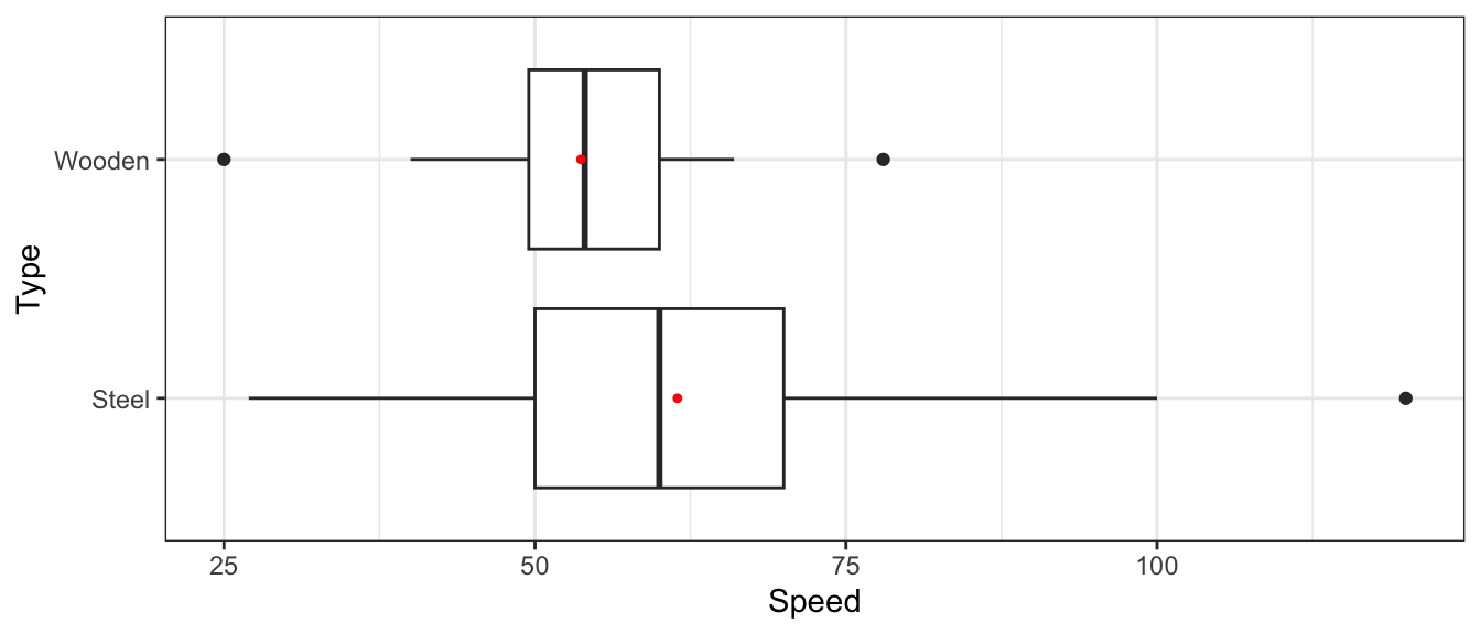
We’ll work with the data set on 146 roller coasters from around the world. We’ll attempt to predict the speed of a coaster (in mph).
Summary information on the speeds of coasters is shown below.
summary(Coasters$Speed)
   Min. 1st Qu.  Median    Mean 3rd Qu.    Max.
  25.00   50.00   57.00   59.11   66.00  120.00
a)
Consider a model of the form:
Model 0:
\[\widehat{\text{Speed}} = b_0 \]
What is the value of \(b_0\)?
b)
Speeds are broken down by type of coaster (steel or wooden).
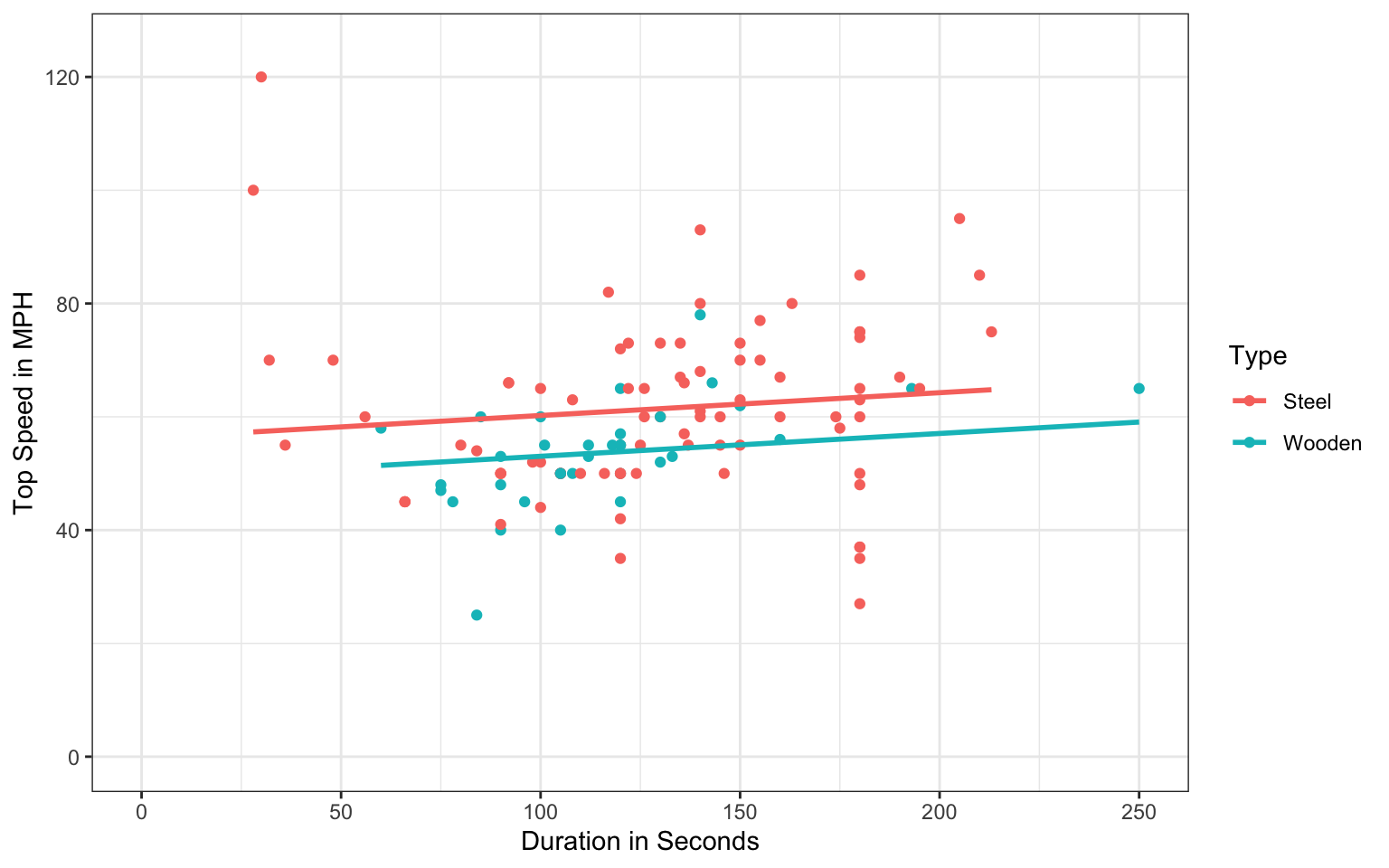
A scatterplot corresponding to this model is shown again below.
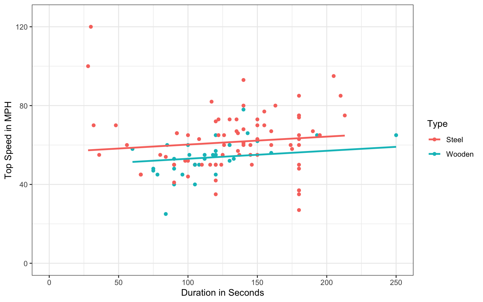
ggplot(data=Coasters, aes(x=Duration, y=Speed, color=Type))+geom_point() +xlab("Duration in Seconds") +ylab("Top Speed in MPH") +geom_parallel_slopes(se=FALSE) +ylim(c(0,125)) +xlim(c(0,250)) +theme_bw()
Approximately what are the values of \(b_0\), \(b_1\), and \(b_2\)? (Hint: you may need to extend the lines to answer one or more of these.)
3)
Continuing with the roller coaster dataset, suppose we want to predict speed of the coaster (in mph), using either design or duration (in seconds) as explanatory variables.
a)
Let’s look at the number of coasters with each design type.
summary(Coasters$Design)
4th Dimension        Flying      Inverted      Pipeline      Sit Down
            0             2            15             1            95
     Stand Up     Suspended          Wing
            5             1             0
Why might using design in this form in a statistical model be problematic?
b)
Continuing with the roller coasters data, we’ll modify the design variable to categorize each coaster as either “Sit Down” or “Other”.
        Coaster                       Park   Design Duration Speed
1 Zippin Pippin                Libertyland Sit Down       90    40
2   Jack Rabbit             Kennywood Park Sit Down       96    45
3   Thunderhawk                Dorney Park Sit Down       78    45
4  Giant Dipper Santa Cruz Beach Boardwalk Sit Down      112    55
5   Thunderbolt             Kennywood Park Sit Down      101    55
6       Wildcat             Lake Compounce Sit Down       75    48
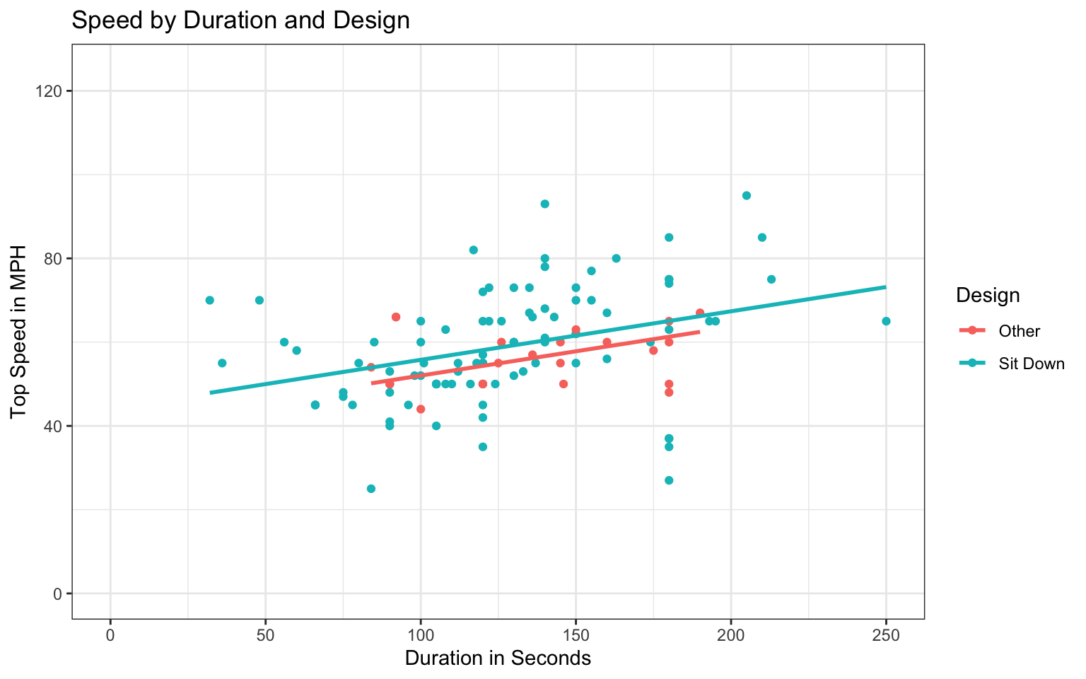
Shown below are scatterplots displaying the relationship between duration and speed, colored by design type.
Notice that in Plot A, there are 2 coasters with very fast speeds, of 100 mph or more. These appear to be outliers. In plot B, the outliers are removed from the dataset. Parallel regression lines for each type of coaster are fit in each plot.
        Coaster                       Park Max_Height   Design Speed
1 Zippin Pippin                Libertyland         70 Sit Down    40
2   Jack Rabbit             Kennywood Park         40 Sit Down    45
3   Thunderhawk                Dorney Park         80 Sit Down    45
4  Giant Dipper Santa Cruz Beach Boardwalk         70 Sit Down    55
5   Thunderbolt             Kennywood Park         70 Sit Down    55
6       Wildcat             Lake Compounce         85 Sit Down    48
PlotA <-ggplot(data=Coasters, aes(x=Duration, y=Speed, color=Design))+geom_point() +xlab("Duration in Seconds") +ylab("Top Speed in MPH") +geom_parallel_slopes(se=FALSE) +ggtitle("Plot(A) - Including Outliers") +ylim(c(0,125)) +xlim(c(0,250)) +theme_bw()
PlotB <-ggplot(data=Coasters_filtered, aes(x=Duration, y=Speed, color=Design))+geom_point() +xlab("Duration in Seconds") +ylab("Top Speed in MPH") +geom_parallel_slopes(se=FALSE) +ggtitle("Plot(B) - Removing Outliers") +ylim(c(0,125)) +xlim(c(0,250)) +theme_bw()
grid.arrange(PlotA, PlotB, ncol=2)
How does removing the outliers affect the slope and intercepts of the regression lines relating speed and duration for each type of coaster? Which plot do you think more accurately captures the relationship between speed and duration? Explain your answer.
4)
We’ll continue with the coasters_filtered dataset that excludes the two outliers, and continue to classify each coaster design as either “sit-down” or “other”. In each part, you are asked to interpret model estimates. State the numerical value of each estimate specifically in your interpretation, as is done in Section 2.1 of the class notes.
a)
Consider a model of the form
Model 0:
\[\widehat{\text{Speed}} = b_0\] The coefficient estimate \(b_0\) for this model is shown below.
Call:
lm(formula = Speed ~ Duration + Design, data = Coasters_filtered)

Coefficients:
   (Intercept)        Duration  DesignSit Down
       40.4307          0.1159          3.7580
Write sentences interpreting the estimates \(b_0\), \(b_1\), and \(b_2\) in context.
5)
Continuing with the model in 4(d), we’ll predict the speed of a roller coaster using duration and whether it has a sit down design as explanatory variables. The model is
\[\widehat{\text{Speed}} = b_0 + b_1\times\text{Duration} + b_2\times\text{DesignSitDown} \] A scatterplot displaying the relationship is shown below.
Call:
lm(formula = Speed ~ Duration + Design, data = Coasters_filtered)

Coefficients:
   (Intercept)        Duration  DesignSit Down
       40.4307          0.1159          3.7580
a)
Use the model to calculate the predicted speed of a sit down coaster with duration 150 seconds.
b)
Explain how you could make the prediction in (a) from the scatterplot. Is your calculated speed consistent with the plot?
c)
Given that not all coasters of the same type and duration have the same speed, we cannot be sure that a sit down coaster with duration 150 seconds will have exactly the predicted speed. Using the scatterplot, give a range of speeds that you can be confident will contain the speed of an individual sit down coaster with duration 150 seconds.
d)
Suppose that Coasters A and B are both sit down coasters and that Coaster A has a duration 10 seconds longer than B. Which coaster has the faster predicted speed, and by how much?
e)
Suppose that Coasters C and D have the same duration, and that Coaster C is a sit down coaster, and D isn’t. Which coaster has the faster predicted speed, and by how much?
6)
Continuing with the model in Question 5, excluding outliers, the \(R^2\) value is shown below.
summary(M_Coasters_speed_dur_des)$r.squared
[1] 0.1410659
a)
Write a sentence interpreting this value in context.
b)
We add year built (since 1900) as an explanatory variable. The \(R^2\) value is shown below.
Does dropping design from the model hurt our ability to predict speed? Explain your answer.
7)
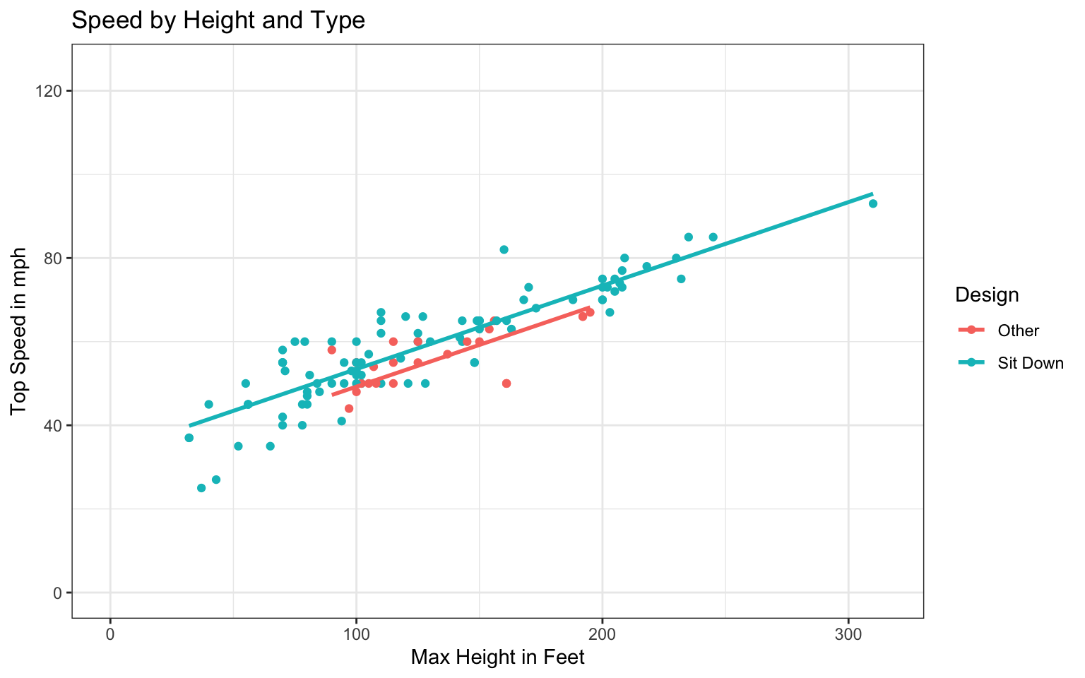
The scatterplot shows the relationship between top speed of a coaster (in mph) and its maximum height and design type. We again exclude the two outlier coasters.
ggplot(data=Coasters_filtered, aes(y=Speed, x=Max_Height, color=Design)) +geom_point() +ylab("Top Speed in mph") +xlab("Max Height in Feet") +geom_parallel_slopes(se=FALSE)+ggtitle("Speed by Height and Type") +ylim(c(0,125)) +xlim(c(0,315)) +theme_bw()
Call:
lm(formula = Speed ~ Max_Height + Design, data = Coasters_filtered)

Coefficients:
   (Intercept)      Max_Height  DesignSit Down
       29.5120          0.1979          4.1504
Should we expect the model that predicts speed using height as an explanatory variable to have a higher or lower \(R^2\) value than a model that uses duration as an explanatory variable (hint: compare this scatterplot to the one in Question 5)?
8)
Continuing with the roller coasters data, now consider a model of the form
What are the values of SST, SSR, SSM, and \(R^2\)?
9)
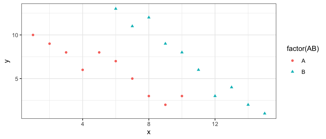
The scatterplot shows a response variable (y), plotted against a quantitative explanatory variable (x), with a categorical explanatory variable, (either A or B) indicated by color and shape.
Consider three models. Model 1 accounts for only the quantitative variable \(x\). Model 2 accounts for only the categorical variable, while Model 3 accounts for both the quantitative variable \(x\) and the categorical variable.
Model 1:
\[\hat{y} = b_0 + b_1x \]
Model 2:
\[\hat{y} = b_0 + b_1\text{CategoryB} \]
Model 3:
\[\hat{y} = b_0 + b_1\text{CategoryB} + b_2x \]
a)
Without calculating \(R^2\), state approximately what \(R^2\) would be for each of Models 1, 2, and 3. Choose from:
Between 0 and 0.25
Between 0.25 and 0.50
Between 0.50 and 0.75
Between 0.75 and 1
Justify your answers.
b)
Between Models 2 and 3, which will have a greater estimate of \(b_1\)? Justify your answer.
c)
Between Models 1 and 3, in which model will the coefficient on the variable \(x\) be more extreme? (In Model 1, the coefficient on \(x\) is \(b_1\) and in Model 3, it is \(b_2\).) Justify your answer.
10)
The illustrations below show three different scenarios, each with a categorical explanatory variable with three levels. The red dots indicate the mean for each group.
Suppose we calculate F-statistics comparing a model of the form:
Which scenario will have the largest F-statistic? Which will have the smallest? Explain your answer.
11)
The four models for roller coaster speeds in Question 3 are shown again below. SSR’s for each model are also show. There are 117 roller coasters in the dataset.
Calculate F-statistics for comparing each of the following pairs of models, or explain why it would be inappropriate to do so.
a)
Model 0 and Model 1
b)
Model 0 and Model 2
c)
Model 1 and Model 2
d)
Model 1 and Model 3
e)
Model 2 and Model 3
12)
Continue with the models in Question 11.
a)
The F-statistic for comparing Model 0 to Model 1 is shown below. Based on the size of this F-statistic, what can we conclude about the variable(s) in these models?
The F-statistic for comparing Model 2 to Model 3 is shown below. Based on the size of this F-statistic, what can we conclude about the variable(s) in these models?
Can we say how SST, SSR, and \(R^2\) for this new model would compare to those in the model using the estimates produced by R? Would they increase, decrease, or stay the same? Why?
15)
A small dataset with 6 observations is shown below. There is a categorical explanatory variable with two groups (A and B), and a quantitative response variable.
Obs.
1
2
3
4
5
6
Group
A
A
A
B
B
B
Response (y)
3
4
8
4
6
11
Consider a model of the form:
\[\hat{y} = b_0 + b_1\text{GroupB}\]
a)
Give the values of the estimates \(b_0\) and \(b_1\) that would be produced by the lm command in R.
b)
Using the estimates in (a), calculate SSR, SSM, SST, and \(R^2\).
c)
Suppose instead that we let \(b_0 = 4\) and \(b_1 = 2\) (so that the predicted value for each group corresponds to the median response value for that group). How would you expect SSR for this model to compare to the SSR you calculated in (b)?
d)
Calculate SSR for the values of \(b_0\) and \(b_1\) in (c). Does your answer match what you expected?
16)
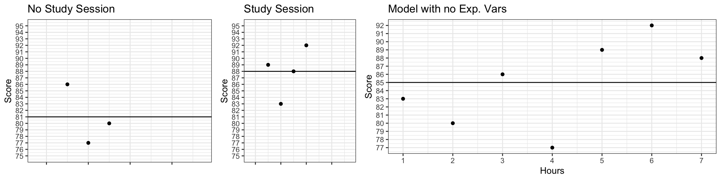
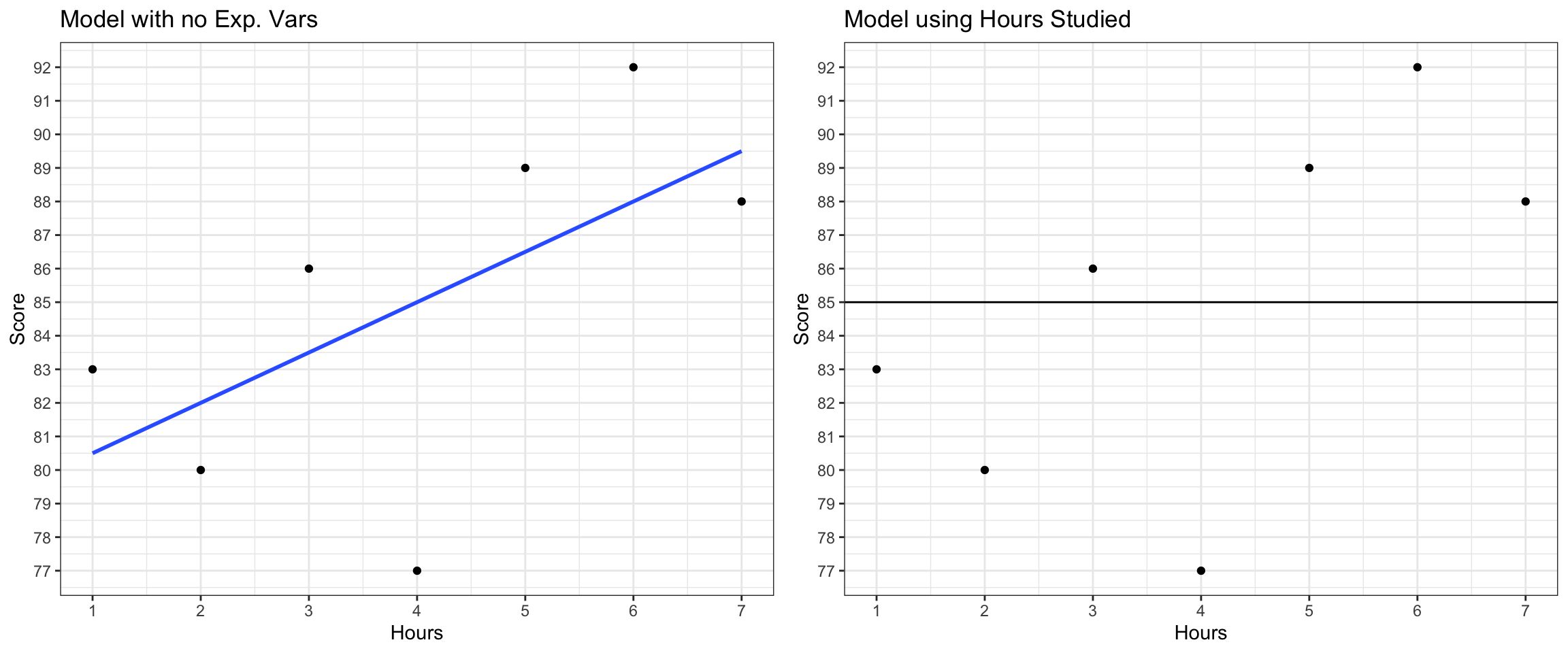
The table displays a set of fictional data, showing scores that seven students received on an exam. Also shown are whether or not the student attended a study session, and the number of hours the student spent studying on their own.
Student
A
B
C
D
E
F
G
Hours
3
4
2
5
1
7
6
StudySession
No
No
No
Yes
Yes
Yes
Yes
Exam Score
86
77
80
89
83
88
92
We’ll attempt to predict Score, using the other variables as explanatory variables.
the predicted scores for each of the seven students in the dataset
the total sum of squares (SST)
the sum of squared residuals (SSR)
the sum of squares explained by the model (SSM)
the proportion of variation in exam score explained by the model using hours studying as the explanatory variable (\(R^2\))
17)
a)
For the fictional test score example in 16(b), write the expression that would need to be minimized to obtain the values of regression coefficients \(b_0\) and \(b_1\). Substitute values from the data into your expression. (Hint: The only variables in the expression should be \(b_0\) and \(b_1\)).
b)
There are three different ways to do this part of the question. You may complete any of the three ways. To get the most from the question, it is recommended that you complete the part that is consistent with the amount of mathematics you have taken previously.
Option A - suggested for students who have taken multivariable calculus (MATH 155)
Use calculus to show that the quantity in (c) is minimized when \(b_0 = 79\), and \(b_1=1.5\). Note: this question is not asking you to plug into the formulas for \(b_0\) and \(b_1\) in 2.4.2 of the notes. Rather, you are to perform the derivation to show that these values of \(b_0\) and \(b_1\) minimize the desired quantity in this context.
Option B - suggested for students who have taken calculus (MATH 140 or equivalent), but not multivariable calculus
Substitute \(b_0 = 79\) into the expression from part A, so that \(b_1\) is the only variable in the expression. Then use calculus to show that this expression is minimized when \(b_1 = 1.5\).
Option C - suggested for students who have not taken calculus
Substitute \(b_0 = 79\) into the expression from part A, so that \(b_1\) is the only variable in the expression. Use an online graphing calculator (such as https://www.desmos.com/calculator) to graph SSR as a function of \(b_1\) (hint, make \(b_1\) the x-variable). Show that SSR is minimized when \(b_1=1.5\). Include a screen shot of your graph.